Trang này dành cho ai? Người chưa biết gì về IELTS Writing Task 1. Mỗi bài giải đều có: đọc biểu đồ → phân tích → công thức → bài viết → giải thích từng câu.
1. Cách đọc biểu đồ — 3 bước bắt buộc trước khi viết
Bước 1 — Đọc tiêu đề: Chart nói về cái gì? Ai? Ở đâu? Khi nào?
Bước 2 — Tìm 4 điểm nổi bật: Cao nhất · Thấp nhất · Tăng nhiều nhất · Giảm nhiều nhất
Bước 3 — Gom nhóm: Nhóm tăng / Nhóm giảm / Nhóm ổn định → mỗi nhóm = 1 đoạn Detail
2. Cấu trúc bài viết — 4 phần cố định
| Phần | Viết gì | Số câu | Có số liệu không? |
|---|---|---|---|
| INTRO | Paraphrase lại đề bài (đổi từ, không chép) | 1–2 câu | ❌ Không |
| OVERALL | 2–3 xu hướng lớn nhất của cả chart | 2–3 câu | ❌ Không |
| DETAIL 1 | Nhóm 1 (VD: nhóm tăng / men > women) | 3–4 câu | ✅ Có số liệu cụ thể |
| DETAIL 2 | Nhóm 2 (VD: nhóm giảm / women > men) | 3–4 câu | ✅ Có số liệu cụ thể |
3. Bài tập 1 — Bar Chart (2 nhóm: Men vs Women)
Đề bài: The chart below shows the number of car trips taken by men and women for different purposes per year in a European city.
Bước 1 — Đọc số liệu
| Mục đích | Women | Men | Ai cao hơn? |
|---|---|---|---|
| Day trip | ~25 | ~30 | Men (nhỏ nhất cả 2) |
| Sports/Entertainment | ~130 | ~150 | Men |
| Visiting friends | ~210 | ~200 | Women (gần bằng) |
| Shopping | ~280 | ~190 | Women (cách biệt lớn) |
| Travelling to work | ~210 | ~325 | Men (cách biệt lớn nhất) |
Bước 2 — Phân tích trước khi viết
– Men cao hơn: đi làm (325 vs 210), sports (150 vs 130), day trip (30 vs 25)
– Women cao hơn: shopping (280 vs 190), visiting friends (210 vs 200)
– Nhỏ nhất cả 2: day trip
– Cách biệt lớn nhất: đi làm (~115 trips)
Bước 3 — Bài giải có chú thích từng câu
📝 INTRO
The bar chart illustrates the number of car trips made per year by men and women for five different purposes in a European city.
🔵 illustrates = thay “shows” từ đề bài (bắt buộc đổi ít nhất 3 từ)
🔵 per year = giữ nguyên đơn vị từ chart (không được bỏ)
🔵 five different purposes = thay vì liệt kê tên 5 mục đích ra
📊 OVERALL
Overall, travelling to work was by far the most common reason men used their cars, whereas women made the greatest number of car trips for shopping. Day trips represented the least popular purpose for both genders.
🔵 Overall, = bắt buộc — không có Overall là mất điểm Coherence
🔵 by far = nhấn mạnh cách biệt lớn (men đi làm 325 >> mục khác)
🔵 whereas = contrast trong 1 câu — 2 nhóm ngược nhau
🔵 KHÔNG có số trong Overall — chỉ nêu xu hướng chung
📋 DETAIL 1 — Men > Women
Regarding commuting, men made approximately 325 car trips to work annually, which was considerably higher than the figure for women at around 210. A similar pattern was observed for sports and entertainment, where men (roughly 150 trips) slightly outnumbered women (around 130). Day trips showed the smallest figures for both sexes, with men at approximately 30 and women at just 25 trips per year.
🔵 Regarding commuting, = mở đầu đoạn bằng topic — thay vì “Travelling to work…”
🔵 which was considerably higher than = so sánh ngay trong câu đầu
🔵 A similar pattern was observed for = câu 2 cùng nhóm — tránh lặp cấu trúc câu 1
🔵 slightly outnumbered = gap nhỏ (150 vs 130) — chính xác hơn “was slightly higher”
🔵 just 25 = “just” nhấn mạnh con số nhỏ
📋 DETAIL 2 — Women > Men
In contrast, women dominated in the remaining two categories. Shopping was the most frequent car trip purpose for women at around 280 trips, compared to only 190 for men — a gap of roughly 90 trips. As for visiting friends, the figures were relatively close, with women making approximately 210 trips and men around 200.
🔵 In contrast, = mở đầu câu mới (≠ “By contrast,” đứng giữa câu)
🔵 women dominated in = topic sentence của đoạn 2
🔵 a gap of roughly 90 trips = nói khoảng cách = phép trừ 280-190, elegant hơn liệt kê
🔵 the figures were relatively close = nhận xét khi 2 số gần nhau (210 vs 200)
4. Bài tập 2 — Table Chart (Survey 3 thập kỷ)
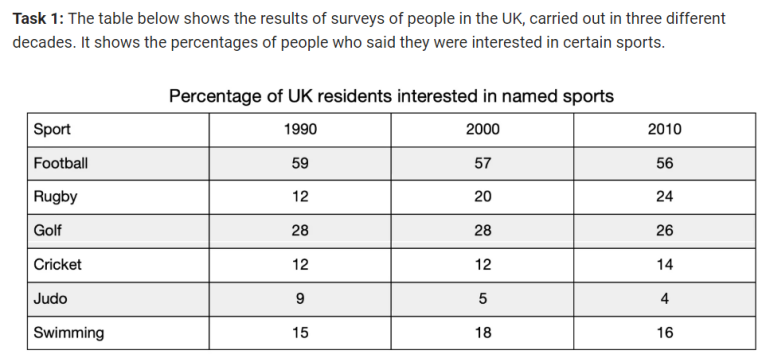
Đề bài: The table below shows the percentages of people in the UK who said they were interested in certain sports, surveyed in three different decades.
Bước 1 — Đọc bảng + phân tích
| Sport | 1990 | 2000 | 2010 | Xu hướng | Nhóm |
|---|---|---|---|---|---|
| Football | 59 | 57 | 56 | ↓ nhẹ (cao nhất) | Detail 2 |
| Rugby | 12 | 20 | 24 | ↑↑ mạnh (x2) | Detail 1 |
| Golf | 28 | 28 | 26 | → ổn định → ↓ nhẹ | Detail 2 |
| Cricket | 12 | 12 | 14 | ↑ nhẹ | Detail 1 |
| Judo | 9 | 5 | 4 | ↓↓ mạnh (thấp nhất) | Detail 2 |
| Swimming | 15 | 18 | 16 | ↑ rồi ↓ | Detail 1 |
Phân tích nhanh:
– Overall câu 1: Football cao nhất suốt (59→56) dù giảm nhẹ
– Overall câu 2: Rugby tăng mạnh nhất (x2), Judo giảm mạnh nhất (9→4)
– Detail 1 = nhóm tăng: Rugby, Cricket, Swimming
– Detail 2 = nhóm giảm/ổn định: Football, Golf, Judo
Bước 2 — Bài giải có chú thích từng câu
📝 INTRO
The table presents the percentage of UK residents who expressed interest in six different sports, based on surveys conducted across three decades: 1990, 2000, and 2010.
🟢 presents = thay “shows” — cho table dùng từ này rất phù hợp
🟢 expressed interest in = paraphrase “said they were interested in”
🟢 based on surveys conducted = câu này NÂNG ĐIỂM — cho thấy hiểu đây là survey data
🟢 across three decades = thay “in three different decades”
📊 OVERALL
Overall, football remained the most popular sport throughout the entire period, despite a slight decline. Rugby experienced the most significant increase, while judo showed the most notable drop over the same period.
🟢 entire period = thêm “entire” để nhấn suốt cả giai đoạn
🟢 despite a slight decline = thừa nhận football giảm nhưng vẫn #1 — sophisticated
🟢 Câu 2: tăng nhất (Rugby) vs giảm nhất (Judo) — 2 extreme trong 1 câu dùng “while”
🟢 KHÔNG có số — Overview không bao giờ có số liệu
📋 DETAIL 1 — Nhóm tăng (Rugby, Cricket, Swimming)
Rugby saw the most dramatic rise, growing from 12% in 1990 to 24% in 2010 — doubling over two decades. Cricket also recorded a modest increase, moving from 12% in both 1990 and 2000 to 14% by 2010. Swimming followed a slightly different pattern, rising from 15% to 18% in 2000 before falling back to 16% in 2010.
🟢 growing from X to Y — doubling = số đầu + số cuối + nhận xét sau em dash — 1 câu nói đủ 3 thứ
🟢 also = từ nối để câu 2 không bắt đầu bằng tên sport — tạo flow tự nhiên
🟢 followed a slightly different pattern = khi Swimming không đi theo xu hướng chung (tăng rồi giảm)
🟢 before falling back to = “before + V-ing” mô tả đảo chiều — 1 câu 2 giai đoạn
📋 DETAIL 2 — Nhóm giảm/ổn định (Football, Golf, Judo)
Football, despite being the dominant sport at 59% in 1990, experienced a gradual decline to 56% by 2010. Golf remained stable at 28% between 1990 and 2000, then dropped slightly to 26% in 2010. Judo, on the other hand, was the only sport to fall consistently, decreasing from 9% in 1990 to just 4% in 2010 — the lowest figure across all sports and all years.
🟢 despite being the dominant sport = thừa nhận Football vẫn #1 — câu dùng “despite + V-ing”
🟢 remained stable… then dropped = Golf 2 giai đoạn rõ: ổn định → giảm
🟢 on the other hand = chuyển sang item contrast trong nhóm
🟢 the only sport to fall consistently = “the only” = điểm đặc biệt → nổi bật
🟢 the lowest figure across all sports and all years = superlative kết đoạn — ấn tượng
5. Lỗi hay gặp nhất — tránh ngay
| Lỗi | Sai | Đúng |
|---|---|---|
| Có số trong Overall | Overall, football had 59% in 1990… | Overall, football remained the most popular sport… |
| Không có Overall | Bài viết đi thẳng vào Detail | Bắt buộc có đoạn Overall — mất điểm nếu thiếu |
| Chép nguyên đề bài | The table shows the percentages of people who said they were interested… | The table presents the percentage of UK residents who expressed interest… |
| Chỉ liệt kê số | Rugby was 12% in 1990, 20% in 2000, 24% in 2010. | Rugby saw the most dramatic rise, growing from 12% to 24% — doubling over two decades. |
| Dùng increase/decrease cho bar chart tĩnh | Men increased in commuting… | Men made more commuting trips than women… / Men dominated in commuting… |
| “By contrast” đầu câu | By contrast, women dominated shopping. | In contrast, women dominated shopping. (By contrast đứng giữa câu) |
6. Bài tập 3 — Pie Chart (2 biểu đồ: Immigration vs Emigration)
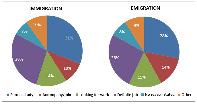
Đề bài: The pie charts show the main reasons for migration to and from the UK in 2007.
Dạng 2 pie charts: So sánh giống nhau trước → khác nhau sau. Dùng “broadly similar patterns” ở Overview.
Bước 1 — Đọc và phân tích
| Lý do | Immigration | Emigration | Nhận xét |
|---|---|---|---|
| Formal study | 31% | 28% | Cao nhất cả 2 — tương đương |
| Definite job | 28% | 26% | Tương đương |
| Looking for work | 14% | 15% | Tương đương |
| Accompany/join | 10% | 14% | ⚠ Khác biệt lớn nhất |
| Other / No reason | 10% / 7% | 9% / 8% | Tương đương, <10% |
Bước 2 — Bài giải có chú thích
📝 INTRO
The two pie charts compare the main reasons why people immigrated to and emigrated from the UK in 2007.
🟣 Two charts are given → dùng “The two pie charts compare” — nối cả 2 chart vào 1 câu intro
🟣 immigrated to and emigrated from = paraphrase “migration to and from” — đổi noun→verb
📊 OVERALL
Overall, the two charts show broadly similar patterns, with formal study being the most common reason in both cases. Work-related reasons combined accounted for the majority of migration in both directions, while the most notable difference was in the “accompany/join” category.
🟣 broadly similar patterns = câu mở Overview chuẩn cho 2 pie charts giống nhau ★ CÔNG THỨC MỚI
🟣 Work-related reasons combined = gộp 2 categories (Definite job + Looking for work) → nêu tổng
🟣 Câu cuối Overview: nêu điểm khác biệt nổi bật nhất — không có số
📋 DETAIL 1 — Điểm giống nhau (majority)
Formal study was the leading reason for both immigration (31%) and emigration (28%), making it the largest single category in both charts. Definite job was the second most common reason, accounting for 28% of immigration and a broadly comparable 26% of emigration. Together, these two categories represented the majority — 59% of immigration and 54% of emigration. Looking for work was also broadly similar at 14% and 15% respectively.
🟣 accounting for = PIE CHART verb chuẩn (thay vì “was” hoặc “had”)
🟣 broadly comparable = 2 con số gần nhau (28% vs 26%)
🟣 Together, these two categories represented the majority = gộp 2 categories → nêu tổng ★ CÔNG THỨC MỚI
🟣 respectively = nối 2 số về đúng thứ tự — kết thúc câu gọn hơn
📋 DETAIL 2 — Điểm khác nhau
The most notable difference was in the “accompany/join” category, where emigration (14%) was considerably higher than immigration (10%). The remaining categories — “other” and “no reason stated” — were broadly comparable across both charts, each accounting for under 10% in both cases.
🟣 The most notable difference was in = mở Detail 2 bằng highlight điểm khác biệt ★
🟣 broadly comparable across both charts = gộp nhiều categories nhỏ vào 1 câu — tránh liệt kê từng cái
🟣 each accounting for under 10% = nêu chung mức độ mà không cần từng số
7. Bài tập 4 — Line Graph (Tourist office 3 kênh liên lạc)
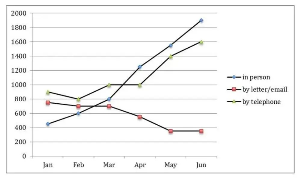
Đề bài: The chart shows requests for information at a tourist office in the United Kingdom from January to June in 2015.
Dạng Line graph: Dùng trend verbs (rose/fell/fluctuated). Tìm: tăng nhất · giảm nhất · giao nhau · đảo thứ hạng.
Bước 1 — Đọc số liệu
| Tháng | In person | Letter/email | Telephone |
|---|---|---|---|
| Jan | ~450 (thấp nhất) | ~750 | ~900 (cao nhất) |
| Feb | ~600 | ~700 | ~800 |
| Mar | ~800 | ~700 | ~1,000 |
| Apr | ~1,250 | ~550 | ~1,000 |
| May | ~1,550 | ~350 | ~1,400 |
| Jun | ~1,900 (cao nhất) | ~350 (thấp nhất) | ~1,600 |
Phân tích trước khi viết:
– In person: tăng ~x4 (450→1900) — tăng mạnh nhất, vượt qua 2 kênh kia từ tháng 3
– Letter/email: giảm liên tục (750→350) — giảm >50%
– Telephone: tăng nhưng chậm hơn (900→1600), ổn định tháng 3–4
– Điểm nổi bật: thứ hạng đảo hoàn toàn — Jan: telephone>letter>in person → Jun: in person>telephone>letter
Bước 2 — Bài giải có chú thích
📝 INTRO
The line graph illustrates the number of information requests received by a UK tourist office through three different channels — in person, by letter/email, and by telephone — from January to June 2015.
🔵 through three different channels = paraphrase thay vì liệt kê 3 kênh ra — compact hơn
🔵 Dùng em dash (—) để liệt kê 3 kênh sau đó — elegant hơn dùng dấu phẩy
📊 OVERALL
Overall, in-person requests rose dramatically over the period to become the most popular channel by June, while letter/email enquiries declined consistently throughout. Telephone requests also followed an upward trend, though less steeply than in-person visits.
🔵 rose dramatically… to become = xu hướng + kết quả cuối kỳ trong 1 cụm
🔵 declined consistently throughout = giảm đều đặn suốt cả kỳ ★ CÔNG THỨC MỚI
🔵 though less steeply = telephone cũng tăng nhưng không mạnh bằng — sophisticated comparison
📋 DETAIL 1 — In person + Telephone (tăng)
In-person visits saw the most dramatic growth, rising from approximately 450 in January to around 1,900 by June — more than quadrupling over just six months. Notably, in-person requests were the least popular channel in January but had overtaken both other channels by March. Telephone enquiries also increased, growing from around 900 to approximately 1,600, though the rise was more gradual and the channel levelled off at around 1,000 between March and April before rising again.
🔵 more than quadrupling = tăng gấp 4 (450→1900) — ấn tượng hơn “increased by 1450” ★ CÔNG THỨC MỚI
🔵 had overtaken both other channels by March = vượt qua — dùng past perfect vì xảy ra trước thời điểm March ★
🔵 levelled off at around 1,000 = telephone ổn định 2 tháng (Mar–Apr) trước khi tăng lại
📋 DETAIL 2 — Letter/email (giảm)
By contrast, requests by letter/email followed the opposite trend, declining steadily from around 750 in January to just 350 by June — less than half the January figure. This channel, which was the second most popular at the start of the period, became the least used by June, with the ranking of all three channels effectively reversing over the six months.
🔵 followed the opposite trend = mở Detail 2 bằng contrast mạnh ★ CÔNG THỨC MỚI
🔵 less than half the January figure = so sánh với điểm đầu kỳ — elegant hơn “decreased by 57%” ★
🔵 the ranking of all three channels effectively reversing = nhận xét tổng quát kết bài — rất ấn tượng ★
Bản viết lại — IELTS 6.5
Intro:
The line graph illustrates the number of information requests received by a UK tourist office through three channels — in person, by letter/email, and by telephone — from January to June 2015.
Overall:
Overall, in-person requests rose dramatically to become the most popular channel by June, while letter/email enquiries declined consistently throughout the period. Telephone requests also increased, though less steeply.
Detail 1:
In-person visits saw the most dramatic growth, rising from approximately 450 in January to around 1,900 by June — more than quadrupling in just six months. Although the least popular channel at the start of the period, in-person requests had overtaken both other channels by March. Telephone enquiries also increased over the period, growing from around 900 to approximately 1,600, though the rise was more gradual.
Detail 2:
By contrast, requests by letter/email followed the opposite trend, falling steadily from around 750 in January to just 350 by June — less than half the January figure. As a result, the ranking of all three channels effectively reversed over the six-month period.
⚠️ Điểm khác so với bản gốc:
– Overall rút xuống 2 câu (bỏ câu telephone), đủ 2 xu hướng chính nhất
– Bỏ “Notably” (quá formal với 6.5) → thay bằng “Although”
– Câu cuối gộp gọn: “effectively reversed over the six-month period”
– Wordcount: ~155 từ — đúng tầm Task 1
Minh An